
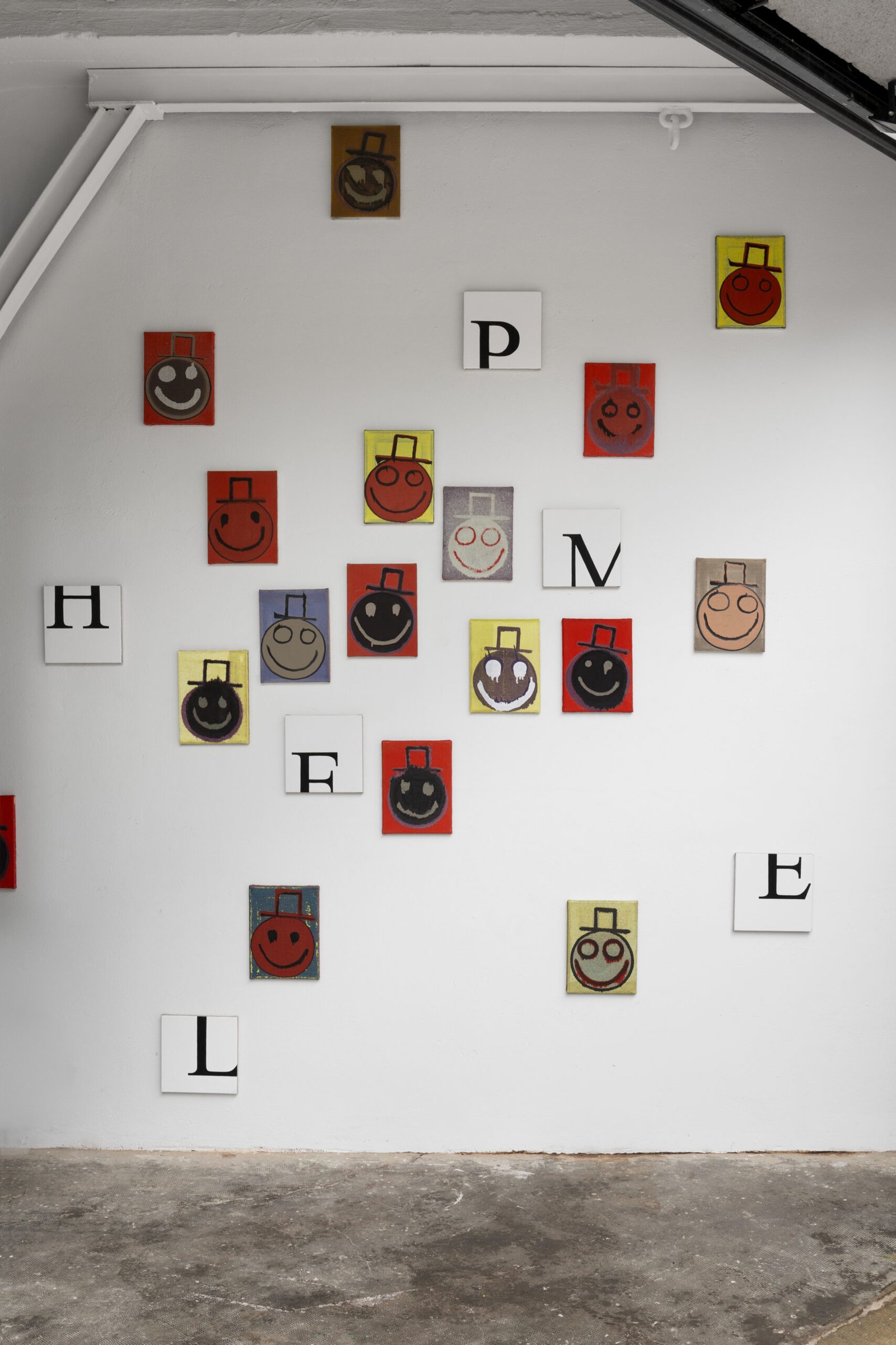
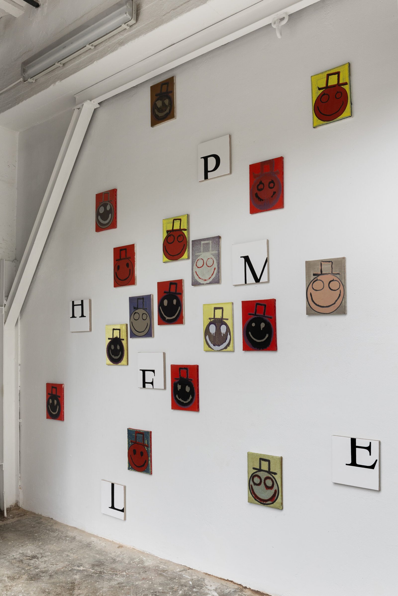
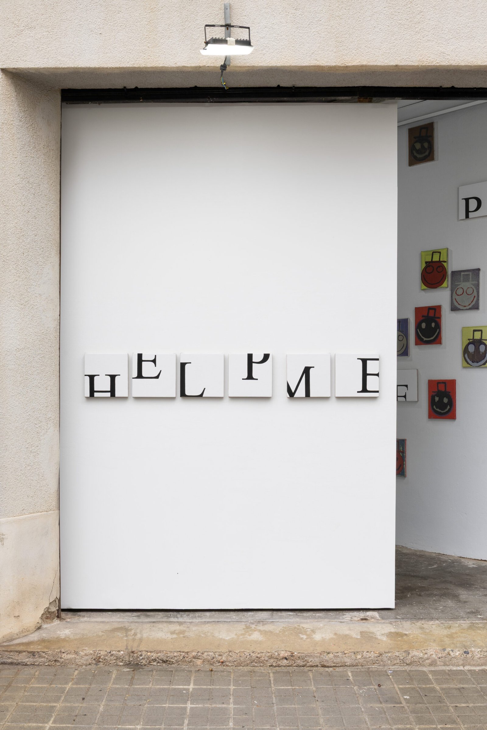
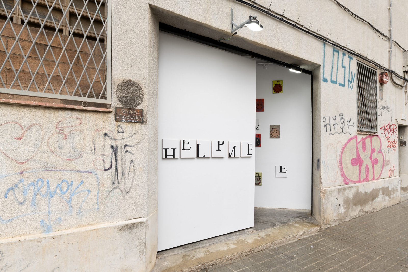

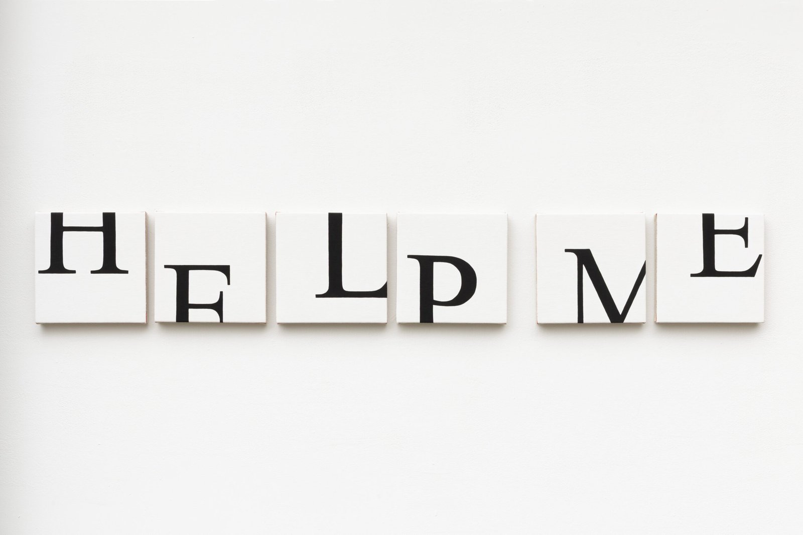
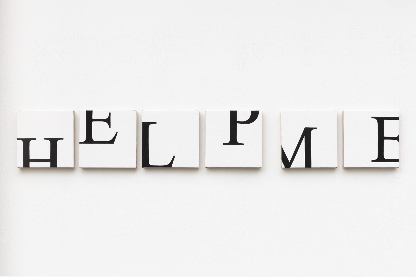
Help Me by Joshua and Tisch Abelow
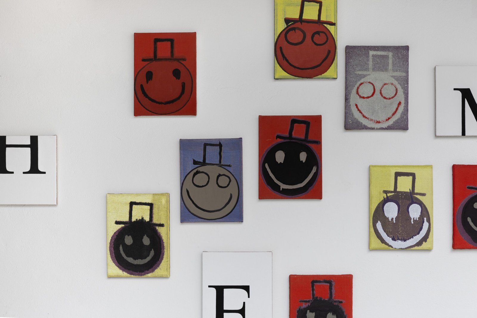
The basic premise of this exhibition is to pair text and image. Tisch Abelow’s text-based piece, Help Me, was made in response to a group of image-based paintings that Joshua made and selected for this exhibition. This is the first time these siblings are exhibiting together as a duo since 2010.
Joshua: What font are you using, and why did you choose it?
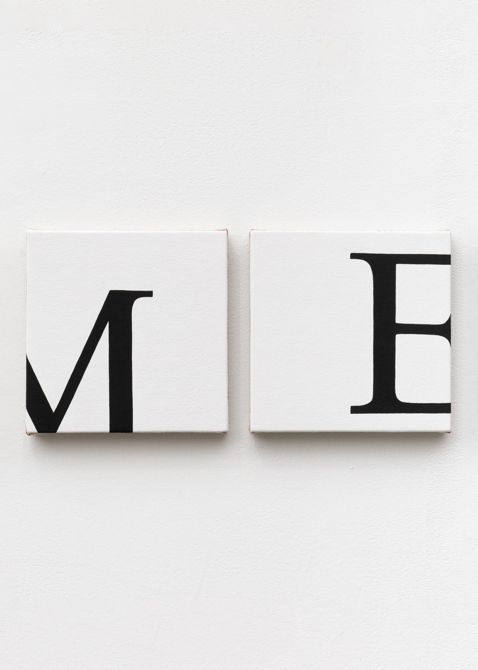
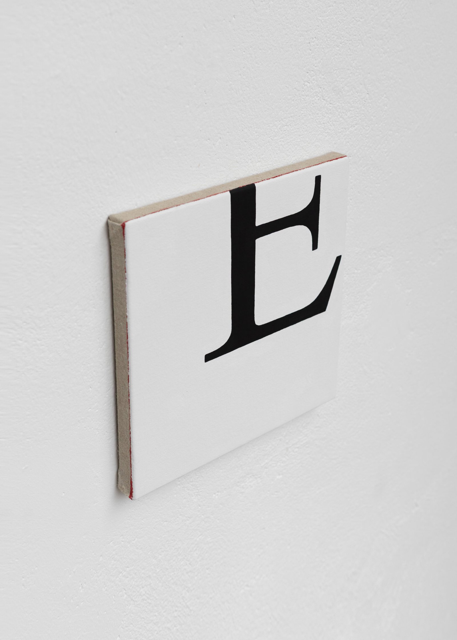
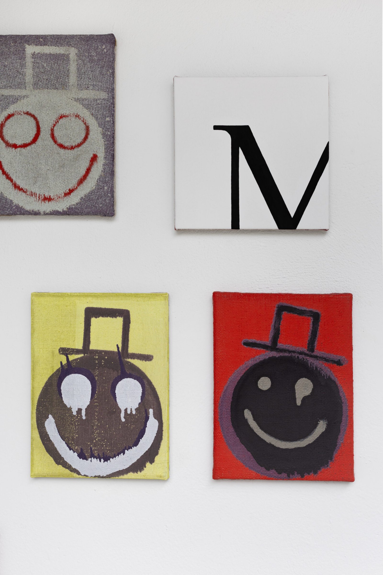
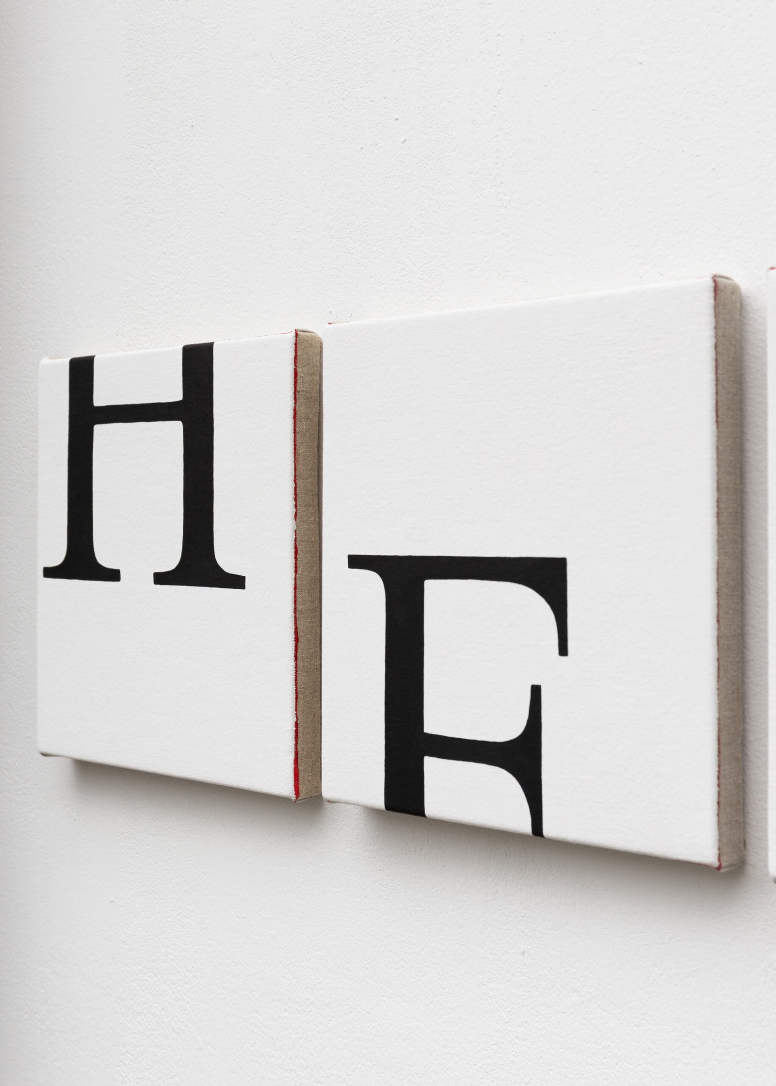
Tisch: Times New Roman – it is the most standard, automated font; the most deadpan. Like, it’s a very basic, everyday font in a Word document. Not expressive, which contradicts the phrase I use in my piece.
Joshua: Is it the font that old typewriters had?
Tisch: I’m not sure.
Joshua: Okay, I just looked it up. It was designed for newspapers, specifically The Times of London, which debuted the font in 1932. It became widely used in publishing and is still popular. I think it’s interesting that you were drawn to this particular font, because you’re using it in an unusual manner – breaking up each letter into individual units, as well as cropping, etc. One other thought is that you said you were drawn to the font because it’s essentially banal, but it’s also a loaded choice because it’s been so widely disseminated as a means to convey information in newspapers and publications. I wonder if you have any thoughts about this?
Tisch: That’s interesting. What comes to mind is how fragmented news and information is today. We have access to more information than ever, but everyone is fed various sources based on our “feeds,” so there’s no shared reality. Obviously, “fake news” is a phrase that has become popular. And actual newspapers are somewhat obsolete because of the internet. I like that Times New Roman references printed paper – and I use black font on white backgrounds – because all this media fragmentation is crazy-making, and I think everyone can relate to the phrase “help me” these days.
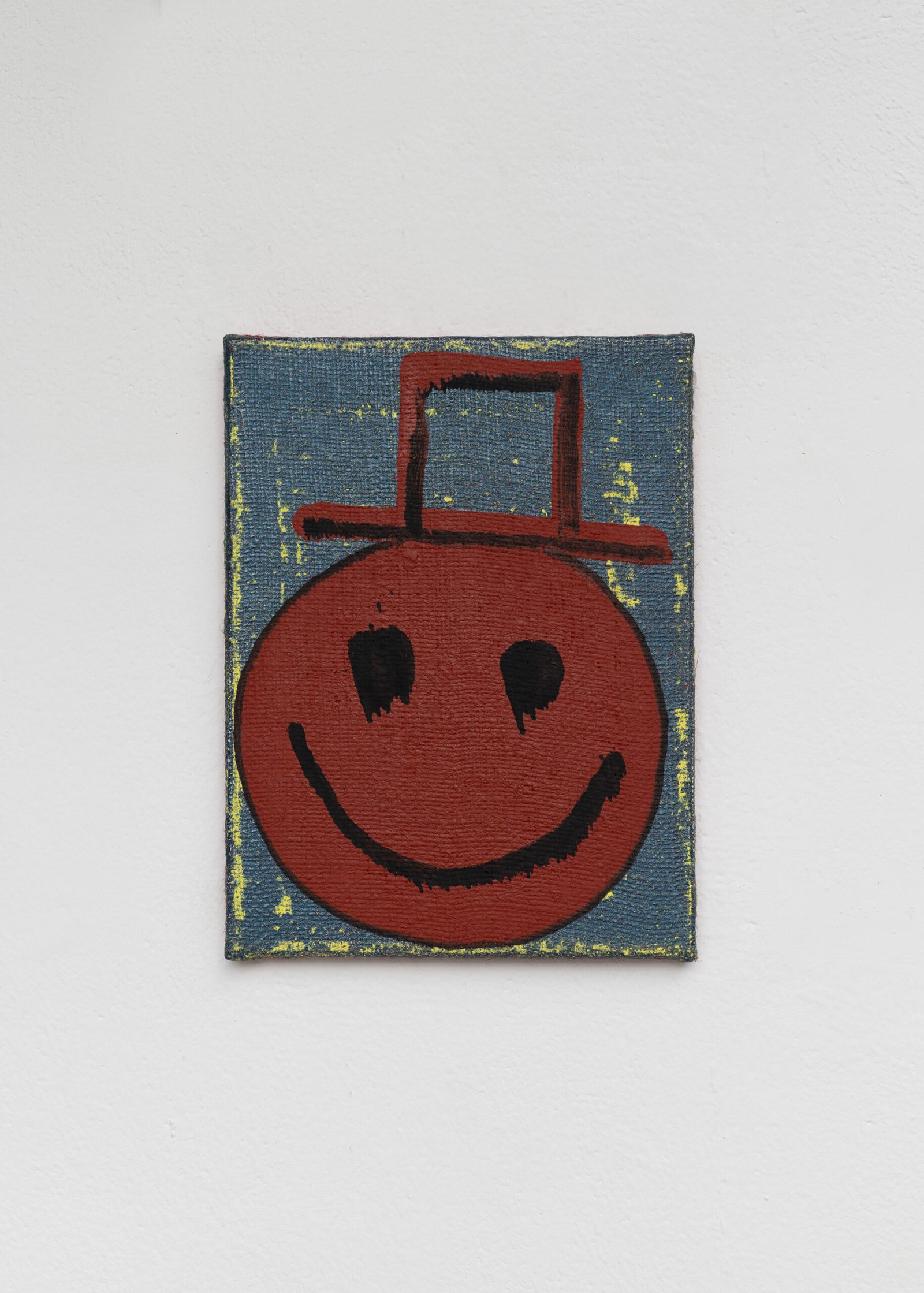
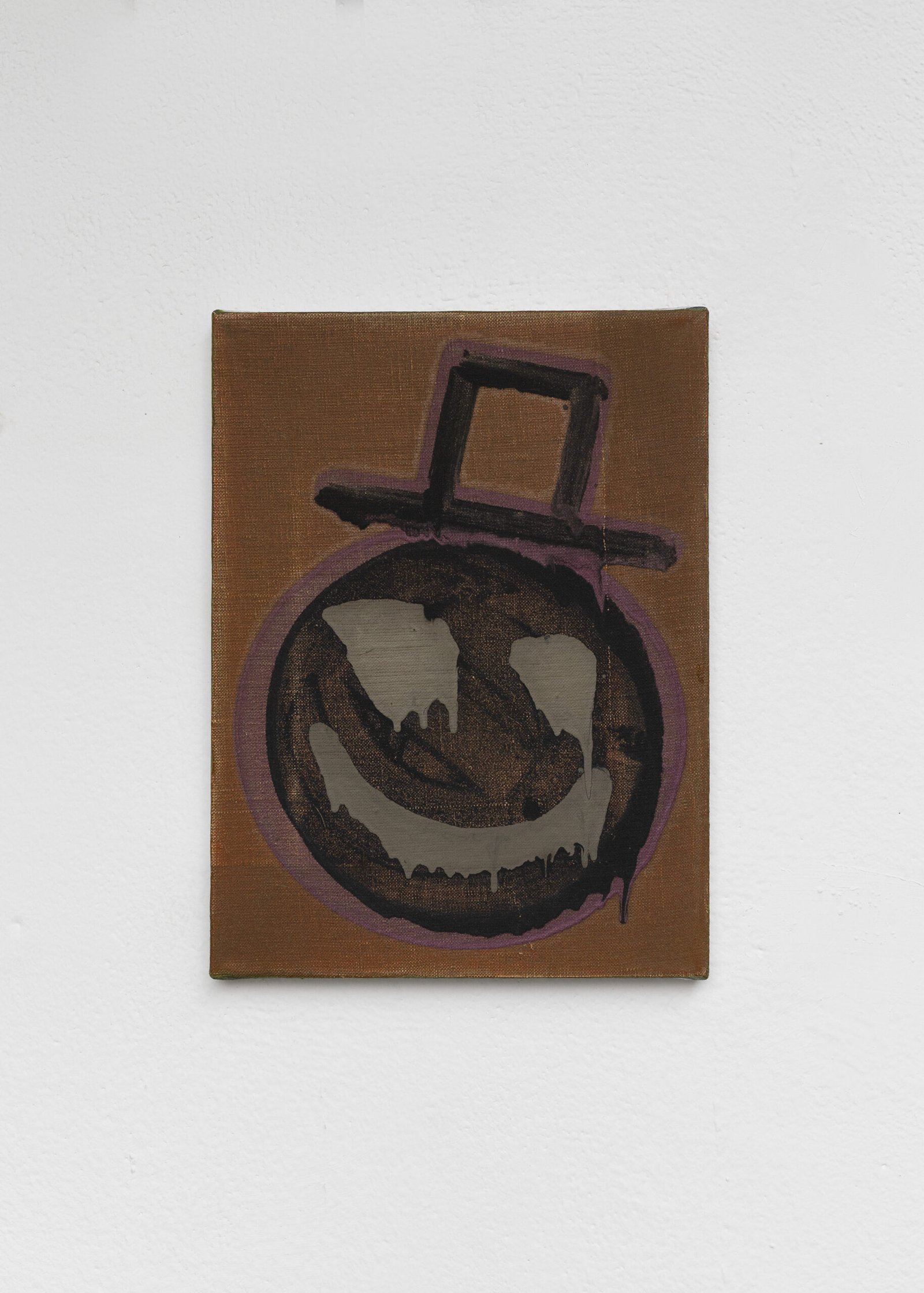
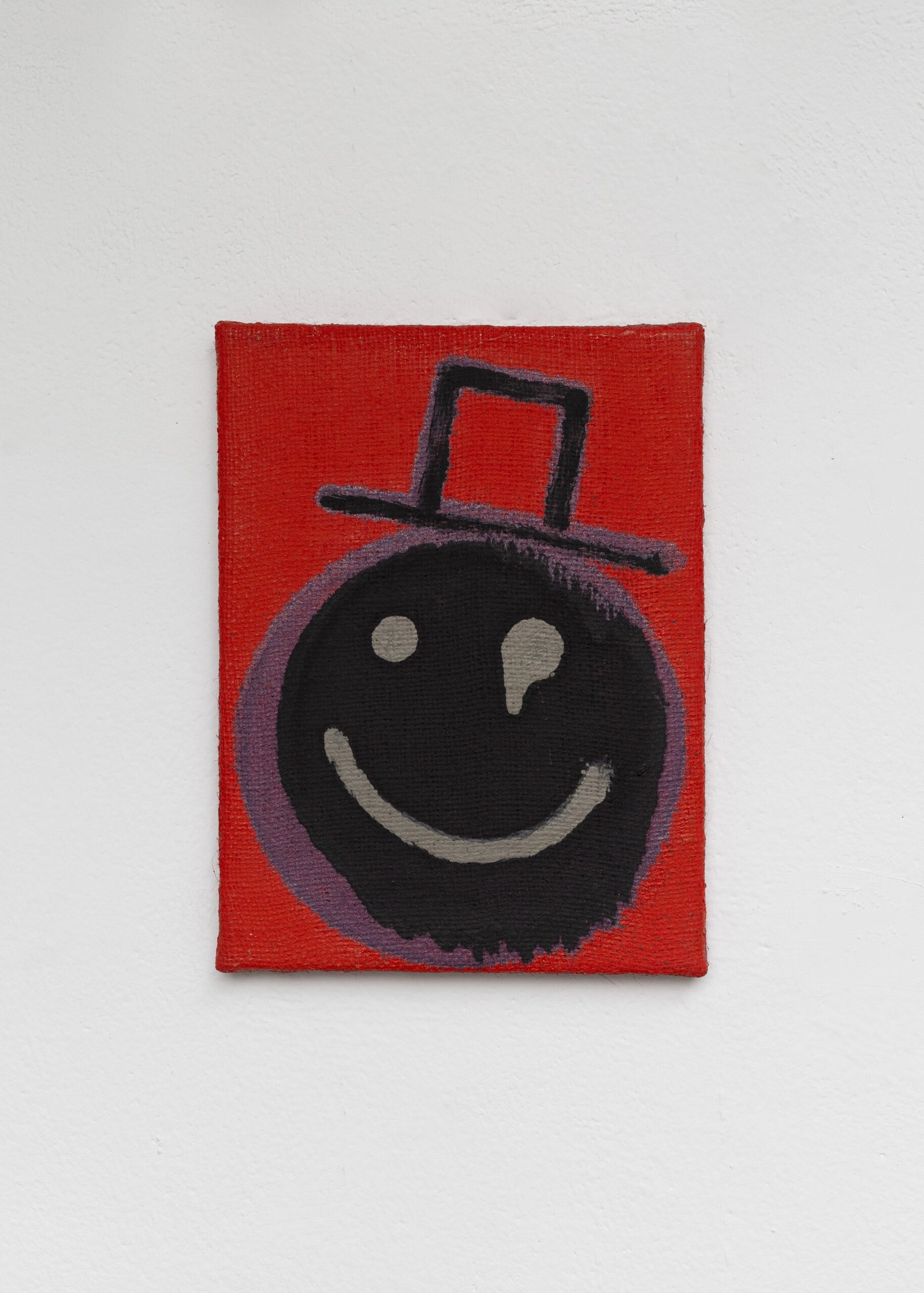
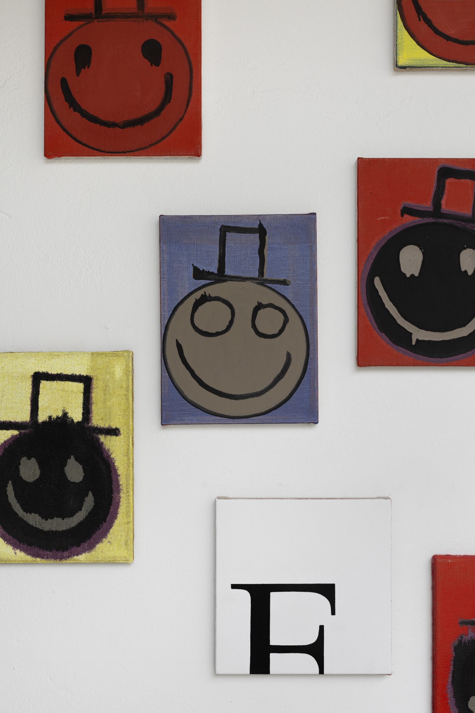
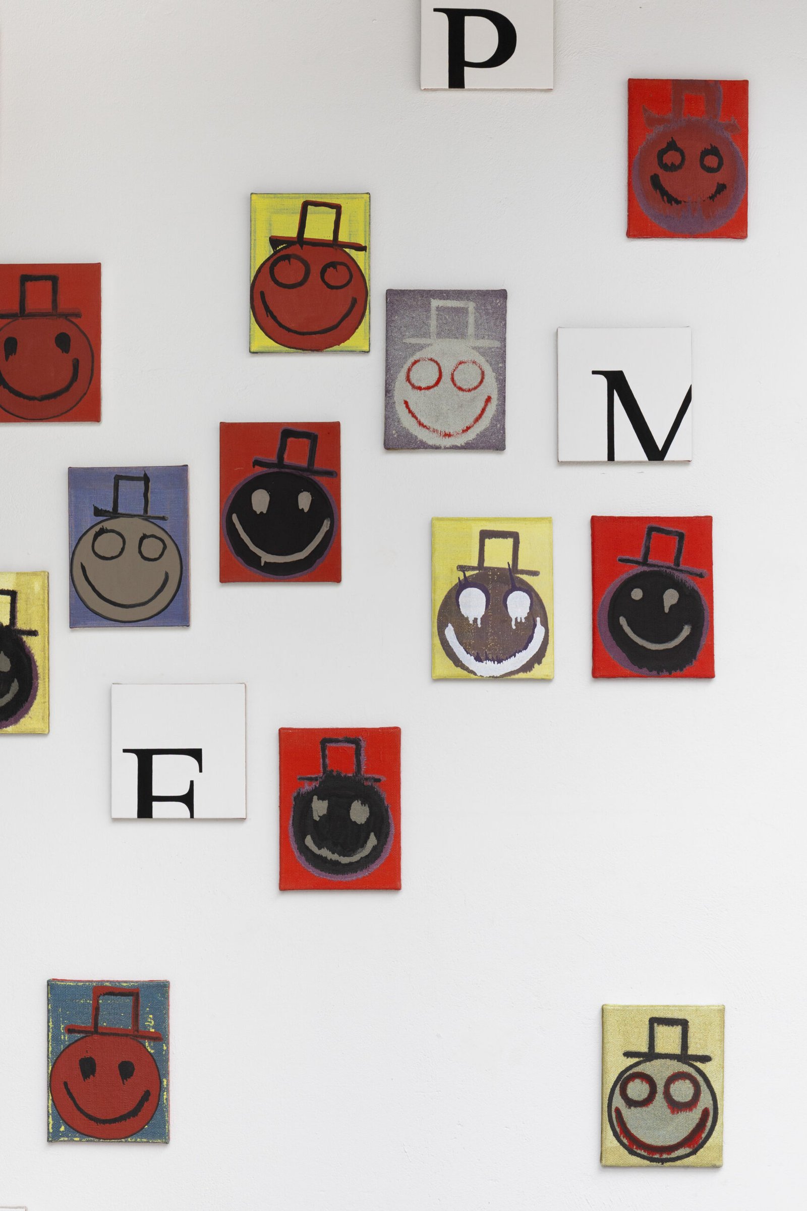
Joshua: That resonates with me so much. Your paintings appear to be black and white at first, but then you see the red ground on the edges and it changes the read and points to a possible emotion: anger. A lot of my paintings for this show also have red.
Tisch: Why did you select these particular paintings for the show?
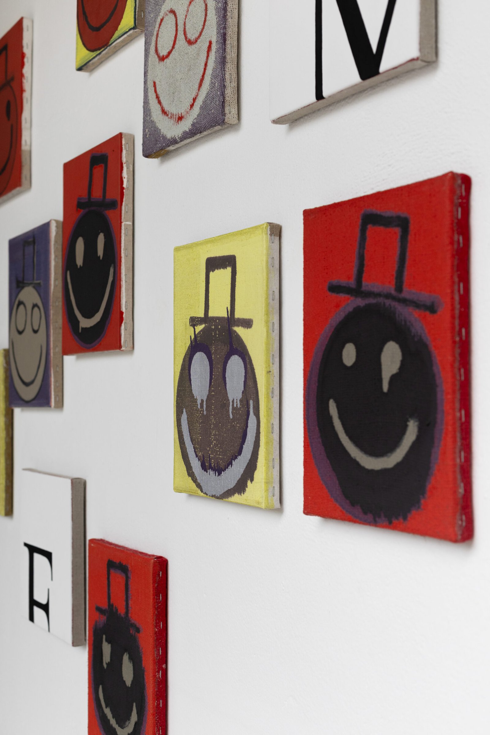
Joshua: For one thing, these paintings have never been exhibited as a group and I still like them. I’ve been thinking about them lately, I guess, because we are living through a period of such dramatic escalation in performative politics. Like you said, information is unstable and easily manipulated. And there’s a very real scenario in which superintelligence wipes out humanity in the not-so-distant future. These paintings touch on certain anxieties that I have regarding these issues.
Tisch: The smiley faces in your paintings do look scary.
Joshua: Do they? [laughs]
Tisch: Yeah, they make me laugh, but the laughter is coming out of a sort of defensive uneasiness. The smiles seem more deranged and menacing than happy. The faces bleed into the surfaces as if they are back from the dead. They leave me wondering whether I might become one of them, or if I already am – like trying to put on a happy face when actually things are pretty dark.
Joshua: See, this is why we are siblings. [laughs]
Tisch: I learned that the first smiley face logo was created by Harvey Ball in 1963. It took him ten minutes and he was paid $45 by the State Mutual Life Assurance Company with the purposes of boosting employee morale after a merger.
Joshua: That must’ve been before irony became the primary purpose of communicating with symbols. [laughs] I remember being irritated by the “Don’t Worry, Be Happy” song by Bobby McFerrin because of its lack of irony – I just kept thinking, what if I don’t want to be fucking happy? FUCK OFF! Also, apparently, the smiley face that Cobain designed for Nirvana’s logo in the early 1990s was inspired by one he saw on the marquee of the notorious Seattle strip club called The Lusty Lady. It said, “Have an Erotic Day!” I’m very attracted to inversions of meaning through simple gestures as well as appropriating an appropriation. Now that I’m thinking about it, the smiley face is as banal as New Times Roman font. It’s interesting that we are both using these pre-existing, well-known things as springboards for our work. Tisch: Yeah, I feel like we’ve both often gravitated toward loaded simplicity (also an inversion) in our work. Maybe it’s because we grew up in quintessential American suburbia, but with layers of family trauma just below the surface. Our work addresses the cognitive dissonance of today’s status quo for sure.